Panorama allows you to view your data and indicators in a personalized way. It is possible to move and reposition graphs and tables, customize cores, define the ordering of data in an ascending or descending manner, among other options that you will learn about now.
Check out this article:
How to customize and edit a dashboard?
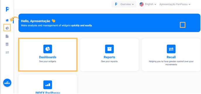
Step 1: Access your account via the link acesso.paripassu.com.br and enter your username and password to log in. From your account home screen, select the Panorama tool.
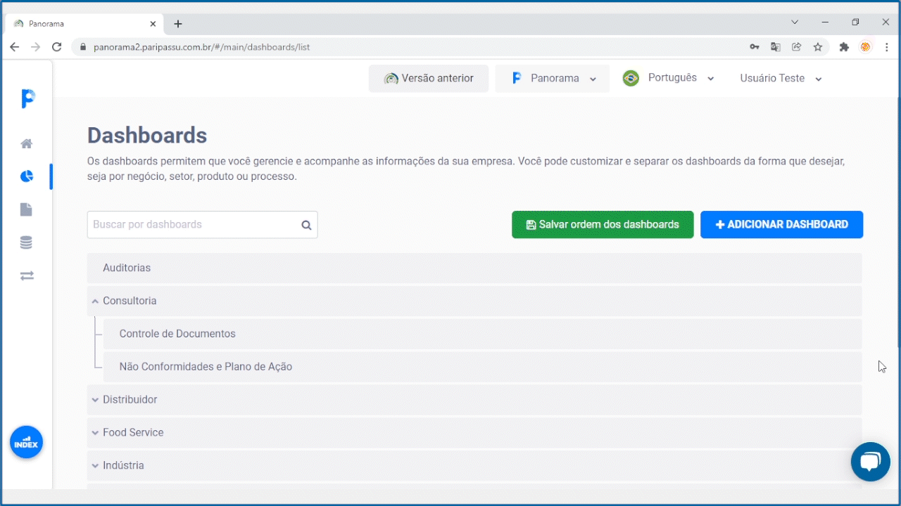
Step 2: On your Panorama's home screen, select the "Dashboards" option in the central menu of your screen. You can also access them through the side menu in the left corner of your screen, just click on the icon  .
.
Step 3: On the Dashboards screen, select the dashboard you want to customize.
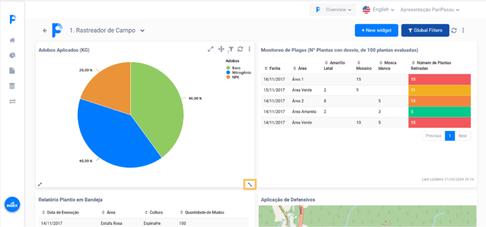
Step 4: In the dashboard you selected, notice that there are buttons for customizing both the dashboard and each of the included indicators, as well as resizing icons in the footer of each indicator.
Attention: The indicator buttons and resize icons will only be displayed when you hover the mouse over the indicator.
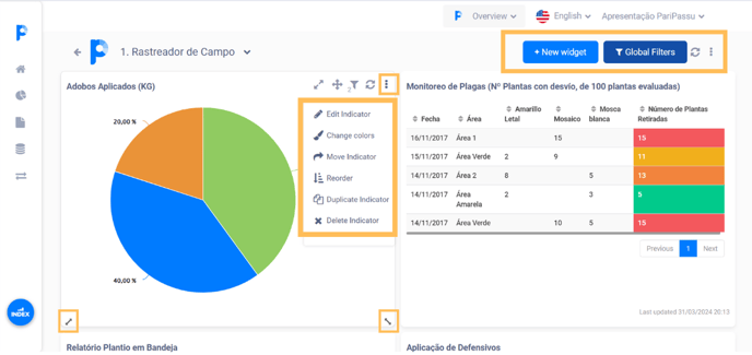
Let's get to know the functionalities of each of the buttons at the top of the dashboard, located in the right corner:

This button will only be displayed when any modification occurs to the dashboard and it is used to save the latest version. Remember to click on it whenever it is available so as not to lose your changes.
![]() This button allows you to add graphical or textual indicators.
This button allows you to add graphical or textual indicators.
If you have questions about new indicators, CLICK HERE to understand how to add indicators to the dashboard.


This button activates the dashboard's global filters auxiliary screen, shown on the right. There you can check all the filters related to the dashboard.
![]() This button allows you to enlarge the indicator to better visualize it. After you increase it, just click
This button allows you to enlarge the indicator to better visualize it. After you increase it, just click![]() to return to the panel again.
to return to the panel again.

This button is a menu for accessing specific features.
See below one by one:
![]()
This button will only appear on dashboards with report sending configured. When you click on it, the PDF is sent to the target contacts.
![]()
This button downloads the dashboard report in PDF.
![]()
This button gives access to the editing screen on the dashboard.
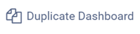
This button duplicates the dashboard with all indicators included.
![]()
This button permanently deletes the dashboard.
Now, let's get to know the functionalities of the indicator editing buttons:
Keep in mind that these buttons will only appear when you hover your mouse over the desired indicator.
Options vary depending on the type of indicator.
To move
 → This button allows you to move the indicator to any area of the dashboard. To use it, you must click and hold the main mouse button, moving the cursor to reposition the indicator.
Local filters
 → This button displays local filters, that is, filters configured solely for this indicator. When you click on it, the global filters screen will be displayed on the right of the dashboard with the list of local filters and global filters.
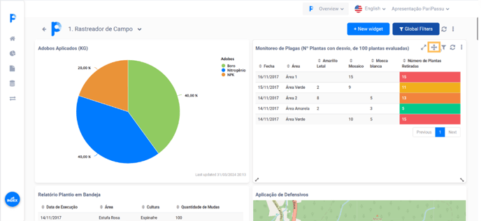
To update → This button updates the indicator data only. To update all indicators at the same time, click the update button located in the upper right corner of the dashboard.
Menu
 → This button is a menu for accessing specific features.
See below one by one:
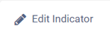 → Gives access to the indicator editing screen.
If you have questions about editing or creating new indicators,
![]() → This button displays a screen for editing the colors displayed in the graph. You can even use different tones for each variable and even for results above or below a specific value (defined by you).
→ This button displays a screen for editing the colors displayed in the graph. You can even use different tones for each variable and even for results above or below a specific value (defined by you).
To choose new colors for the different fields of the indicator, simply click on the rectangle located on the right side of the field and then select the desired color.
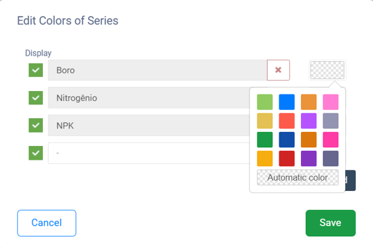
Some fields display this icon  on the right side of the field. This signals that you can set different colors to different values. You can use this function to configure different colors for notes above and below average, for example.
It is worth remembering that the color editing possibilities vary according to the type of indicator.
![]() → Displays a screen that allows you to move the indicator from one dashboard to another. You can still remove the indicator from the original dashboard or duplicate it, to ensure that it remains on both the new dashboard and the original dashboard.
→ Displays a screen that allows you to move the indicator from one dashboard to another. You can still remove the indicator from the original dashboard or duplicate it, to ensure that it remains on both the new dashboard and the original dashboard.
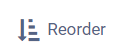 →Displays a screen where it is possible to change the order of data in an indicator, reorganizing information and/or limiting the amount of data.
For example, if an indicator is ordered by date, you can reorder it by note. It is still possible to limit the data shown, which can be useful for indicators that have a large volume of information.
![]() → This button duplicates the indicator and now displays the editing screen for your settings, in case you want to change any of them. Simply continue with the editing and saving steps to add the duplicate indicator to the dashboard. The system will add the term "copy" next to the indicator name to identify duplication.
→ This button duplicates the indicator and now displays the editing screen for your settings, in case you want to change any of them. Simply continue with the editing and saving steps to add the duplicate indicator to the dashboard. The system will add the term "copy" next to the indicator name to identify duplication.
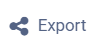 → This button displays a screen with several possibilities for exporting indicator data, allowing you to download your information in several different formats, including even the option to export as a calendar to speed up the creation of events in your calendar service.
If you want to download it as a calendar, you only need to configure the export as a calendar, defining the event information according to your indicator data. In the other options, you must only enable or disable the export possibility.
![]() → This button deletes the indicator from the dashboard.
→ This button deletes the indicator from the dashboard.
Furthermore, it is possible to resize the indicators within the dashboard.
 → These icons will be displayed in the lower left and right corners whenever you hover the mouse over an indicator. Its function is to resize the indicator frame. To do this, simply click on one of the icons and hold down the left (main) mouse button, moving the cursor to enlarge or reduce the frame.
How to create global filters?
In addition to viewing, you can also create new global filters for your dashboard. Remembering that these filters will be applied to all indicators included in your panel, making it easier to highlight specific information.
To learn how to create and apply new global filters, check out the article: What's New in Panorama Global Filters: What's Changed?
How to order and group dashboards?
The dashboard ordering and grouping function allows you to organize the list of your dashboards. For example, you can create a main dashboard with indicators on sales volume and group secondary dashboards for each of your customers. Check out the step-by-step guide on how to carry out this process below:
Step 1: To change the ordering or create groupings, click on the main menu and then on the option  "Dashboards".
step 2: To sort, simply click and hold the left (main) mouse button on the dashboard name and move it to the desired position.
Step 3: To group, simply click and hold the left (main) mouse button on the dashboard name and move it below the panel in which you want to group it. Then, drag the mouse slightly to the right to include the internal dashboard in the main dashboard.
Step 4: Then, you need to click on the "Save dashboard order" button displayed at the top of the screen.
Note: To undo groupings, simply follow the same procedure as moving the dashboard, dragging it to the left and to the desired position within the dashboard list.
It is possible to group several dashboards into a single main dashboard and/or create subgroups.
We hope this article was useful to you! 🍎
If you have any questions, CLICK HERE to contact our Customer Success team! We will be happy to serve you! 🤗💙
To the next! 🖐️